
Hi all,
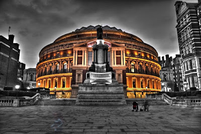
Here is my first real attempt at an HDR shot. What do you think?
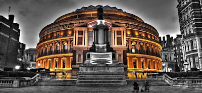
I recon it looks better cropped, but my housemate recons not. Any suggestions?
Tech Details :
focal length : 18mm (27 equiv)
Aperture : 3.5
exposure times : 1/20th, 1/5th and 0.8 seconds
ISO 200
I used qtpfsgui to do the HDR and tone mapping. (fatal algorithm with pregamma 1, alpha 0.644, beta 0.934, saturation 0.47, noiseredux 0)
I then used the gimp to create a black and white version and manually mask the black and white layer to reveal the colour version below. I like the albert hall and the push chair in colour, but I think making the ghost of the girl on the non-cropped version colour may have been over doing it :)


Good to see I'm not the only one using the gimp.
ReplyDeleteVery interesting results, Bob. Personally, I prefer the top one - I think that with the cropping it becomes a bit heavy and that there is not enough negative space (sky and plaza) in the image to balance the imposing buildings. Is that the entire frame, or is it possible to squeeze in a bit more sky at the expense of a bit of the plaza?
The top image is the whole frame, so no more sky. To be honest, it was a miserable day and the sky was mostly uniform grey. It took me quite a while fiddling with the parameters in qtpfsgui to get any detail in the sky at all.
ReplyDeleteI might use the top one as the final image, but remove the ghost girl in the foreground, I think it distracts the eyes too much.
Bob, welcome to the fantastic world of HDR, its a slippery slope and you'll never escape!!
ReplyDeleteMy personally bugbear in HDR images in the haloing you get at the boundary between skys and the buildings. If you are bit a handy with the gimp or photoshop then I would select the sky and cut it out. Take it to another layer and then scale it up by say 10% so that when you put it back behind the building you have lost the halo. It will finish off what is otherwise a fantastic image.
I totally agree with Nick (damn I feel dirty admitting that) the top one works better for me too. As well as the negative space etc I think the cropping of the building to teh right diostracts me, whereas in the top one it some how looks complete. Also the pushchair colouring is a lovely touch.
As for the ghost girl, do it, get rid. If you use Photomatix it can detect people moving through the image (don't know how) and will remove them. Does it with varying degrees of success but usually does it reasonably well.
Nice one bob, keep experimenting.
Very nicely done, definitely one for your wall. I love the color B&W mix and the HDR really adds to the B&W side.
ReplyDeleteI know you spent some time working on the push chair but sorry I don’t like it. Clone it out, takes away from the overall effect. It might even help balance the full shot so no more worry on crop or not.
As Steven mentioned there is some hallowing, try his fix.